%DI Labelling - what does it mean?

If you're into healthy eating then you probably check out food packs for nutrition information. It isn't always clear is it? You may have spotted the %DI on the labels but do you know how to interpret this for you or your children? The food industry believes many consumers are confused by labelling and has come up with a graphic way of presenting the figures on the front of the pack but I'm not sure it will be all that helpful.
What is %DI labelling?
%DI stands for Percentage of Daily Intake. The Daily Intake Guides look like a series of little thumbnails and are a graphic representation of how much one serve of a food contributes to an average day's intake.
The Daily Intake draws its information from the Per serving figures from the Nutrition Information Panel on the back and places it on the front of the pack in a graphic format which is easier to interpret. A picture is faster than reading numbers!
Thumbnails are voluntary
The Daily Intake Guide is a voluntary scheme, which has been developed by the Australian Food and Grocery Council. As of 2013, it appears on over 7,000 food packets.
Some manufacturers choose to display only the %DI for energy (kJ) while others may include information on energy as well as seven nutrients - protein, fat, saturated fat, carbohydrate, sugars, fibre and sodium.
Some products like breakfast cereals also show four vitamins and the mineral iron. Kelloggs were the first to introduce the %DI in mid-2006 followed by Coca-Cola and McDonalds.
Checkout this example
Take a look at the %DI thumbnails from a pack of Just Right breakfast cereal.
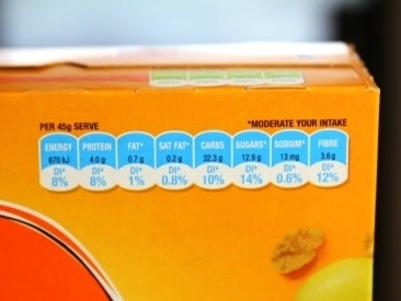
From the above shot, you can see that a "serve" of 45 grams of Just Right (a large bowl) gives you 8 per cent of your kilojoule (energy) intake, 8 per cent of your protein, 1 per cent of fat, 0.8 per cent of saturated fat, 10 per cent of carbohydrates, 14 per cent of sugars, 0.6 per cent of sodium (salt) and 12 per cent of fibre.
Make sure you understand though just a what a "serve" is. Click here to read my article on serve sizes.
In contrast, if you eat a Big Mac, the thumbnails tell you that it gives you 23 per cent of your day's theoretical energy - which makes it more of a meal.
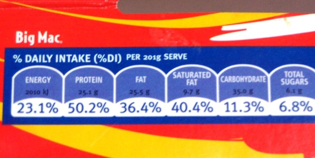
But, you also getting 50 per cent of your protein along with 40 per cent of your saturated fat and 37 per cent of your day's sodium (not shown) - not a good thing. You are getting an "excess" of saturated fat and sodium relative to your kilojoules.
How do they work out the %Dietary Intake?
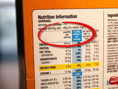
You can see the numbers for yourself - they are simply take the figures from the Per serve column on the nutrition panel on the back of the pack. Then they divide them by the average day's total intake.
→
Nutritionists' gripes
1. The %DI is based on a healthy weight male who consumes 8700 kJ (2300 Calories) per day. If you are a child, female or anyone overweight - all of whom need to consume fewer kilojoules than most males - the numbers won't apply to you.
Take a Big Mac with 2010 kJ as an example again.
- If you are average man, it provide you with 23 per cent of your day's energy intake.
- If you are an average woman, your energy needs would be only around 7500 kJ, 1200 less than the average male. Thus a Big Mac would give you 27 per cent of your total (which is 2010/7500 X 100).
- If you are on a diet and eating only 5000 kJ a day, that same Big Mac would give you a huge 40 per cent of your day's total. You would need to think twice about whether to eat it or not!
- If you are sporty or very active, you'll burn up more kilojoules and therefore the foods contribute LESS of your DI needs.
Rule of thumb:
- If you're burning up LESS than an average man, the percentages displayed would be greater than your required daily intake.
- If you're burning up MORE than the average man, the percentages displayed would be less than your required daily intake.
2. Just using energy (kilojoules) as a way of comparing foods ignores the overall nutrition of a food. It can make unhealthy foods seem like a good choice as it is all about quantity, not quality. There's no judgement as to whether a food is good for you or not - it's left to the consumer to interpret. In contrast, the red Heart Foundation Tick does the work for you in highlighting healthier options with less saturated fat, sodium (but it doesn't tell you how much to eat of them either).
3. The numbers look complicated - there are too many numbers to make it a simple at-a-glance check. If manufacturers rounded the percentages up to the nearest whole number, they would be a lot simpler. [Update from 2013: the numbers are now rounded which is a lot easier!]
The bottom line
For people who aren't numerical and find tables hard to decipher, the thumbnails make the nutrition information panel a little easier to interpret but it's too complicated for people to evaluate foods quickly and easily. It's also male-orientated and given that most often it's still women doing the shopping and trying lose weight, it's just not relevant enough!