MyPlate replaces MyPyramid
The US Department of Agriculture (USDA) recently launched its new healthy eating awareness tool - the MyPlate icon. This easy-to-understand icon replaces the more complex and less helpful MyPyramid. The MyPlate icon which allows American families to understand what they should be eating at a single glance is part of an awareness package that was developed to encourage healthy food choices based on the 2010 Dietary Guidelines for Americans.
Its brightly coloured graphic clearly illustrates the proportions of five food groups (fruits, vegetables, grains, protein and dairy) to be consumed daily.
It's useful as far it goes. It seems to me that the main problem with the average American family's diet is not only the proportions of the five food groups. It's how much processed foods with their hidden ingredients - corn syrup, salt, trans fats, sugar etc - they consume on a daily basis.
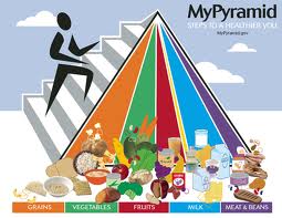
The old and the new
Here's what MyPyramid guide looked like before the plate:
My gripes
1. All the food groups are on one plate would lead you to believe that you have to eat them all at each meal. Who has a plate with fruits, grains, proteins and vegetables for EACH meal?
2. MyPlate shows dairy as a glass, as though the dairy group is only milk and not cheese or yoghurt. This is explained in the accompanying website but I bet many won't read on that far.
3. It mixes food groups with nutrients. It is more usual to use Eggs, Fish, Meat, Poultry and Legumes rather than just the word "protein". If you're trying to educate then you can't just gloss over the component foods that make up "protein". Many ordinary Americans would not realise that nuts and legumes, for example, are part of the protein group.
4. It assumes that everyone eats their meals off a plate. I notice many people eating from a paper bag or cardboard fast food container or snack pack. And drinking via a straw as they walk. But maybe they're not the ones interested in nutrition. They should be.
5. There's no mention of whole grains, which are better for you. Again, in the side notes, you're asked to select HALF your grains as whole grains.
The Aussie wedge-circle
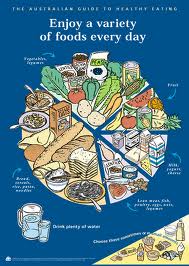 In Australia we have used a pie chart graphic (forgive the pun) since 1998 but the constituents of each of the five food groups are more clearly illustrated. Frankly, I think the Australian Guide to Healthy Eating wedge model is more useful because it:
- Shows that we need a variety of foods within each group to stay healthy
- Highlights that we need to drink plenty of water and
- Includes a "sixth" group of foods that should only be eaten sparingly. This group, which consists of fats, junk or fast foods, sweet drinks and treats, is ignored by MyPlate so burying its head in the sand. [I believe fats should be a basic food group but that's a whole new story].
The dinner plate and rule
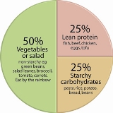 While we need to eat a balance of the five food groups each day we don't need them all at each meal. I like the more practical "dinner plate guide" for a balanced main meal showing you can eat:
- 50 per cent non-starchy vegetables or salad;
- 25 per cent starchy carbs such as potatoes, rice, pasta, etc;
- 25 per cent meat or alternatives.
It gives you guidance on how much and what sort of foods to dish up for dinner.
The bottom line
All in all, I think the MyPlate icon is a clever, engaging way to portray five basic food groups graphically but it's been simplified a little too much – it really is a bit short on important details. It needs - and is supported by - an easy-to-understand website called www.myplate.gov that has sections on
- the five food groups and what they contain
- some useful interactive tools for food planning and tracking
- many useful articles like Steps to a Healthier Weight, Daily Food Plans for Pregnancy and Breastfeeding.
But it's a huge improvement on the too-academic Pyramid that's been the US official food guide since 2005.
MyPlate in the news
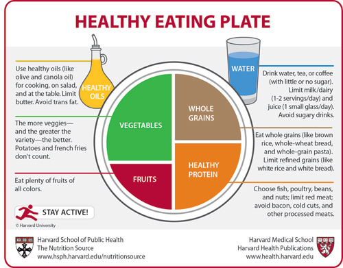 Harvard School of Health has come up with their "improved" version of the USDA MyPlate. The new Harvard Healthy Eating Plate is meant to be a rival with more emphasis on whole grains, water, more vegetables, more protein and little dairy.
Also they have Fats/oils shown and suggest olive or canola oils. I prefer it over the USDA one. Interesting to see how much traction the Harvard version gets as they are an influential group in the US.


